
The need to leverage big data to answer questions and drive decision making is rapidly becoming a cornerstone of the healthcare industry. With the exponential growth of the global datasphere, analysts and decision makers now have more information than they know what to do with. However, gathering insights and interpreting data often require skills and time that the average person simply does not have.
A recent report analyzing the international data landscape, published by International Data Corp. (IDC), concluded that the global datasphere would grow from 33 zettabytes in 2018 to 175 zettabytes in 2025. That’s a whopping increase of 430% —a lot of data in a relatively short amount of time.
But how much is a 430% increase? It’s definitely more, but how much more? The following table provides a helpful visual demonstration.
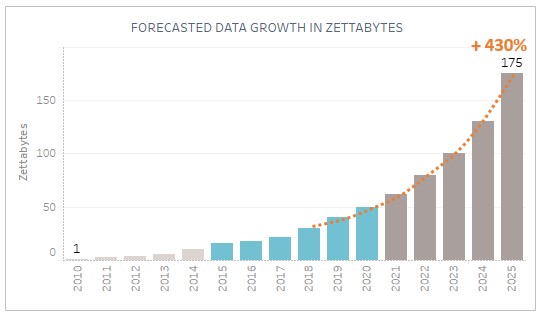
This simple visualization quickly shows how much the global datasphere has grown in the last ten years with an immediate and dramatic representation of the projected growth. In a glance, you’re able to isolate the growth of the last five years, and you’re able to see exactly what a 430% increase looks like since 2018.
Well-crafted visualizations can make complex issues more easily understood by highlighting what’s important and providing context to pressing business decisions. By following simple guidelines, creators of data visualizations can take their audience through an entire story that is easily digested in a short amount of time.
So what makes a good data visualization? Master data visualizer Alberto Cairo, Director of Visualization at University of Miami’s Computational Science Center, believes a great visualization should include these five qualities:
Be Truthful – Data visualizers often make assumptions about the data without doing thorough research or have a predisposed message that they want to impart on the viewer. Keep in mind that with proper analysis, the data will drive the narrative. The job of the data visualizer is, first, to do the research and honestly present the findings; and second, to choose the right visualization for delivering those findings.
Be Functional – This piggybacks on the second job of the data visualizer: choosing the right visualization. If the goal of a visualization is to show time-series trends, choose a chart that allows the viewer to easily decipher those trends. If you have to label a chart with values, maybe there is a better format for displaying that data where the visualization does the talking. The visualization choice should help tell the story, not confuse it.
Be Beautiful – Pay attention to the details. A good data visualization avoids clutter, it’s easy to read, and it doesn’t overwhelm the viewer. Do you really need 3D bars? Do your fonts match? Are your colors distracting or highlighting? This is a delicate balancing act with being functional, but with practice and honest feedback, data visualizers can master this component. And don’t be afraid to look to other data visualizers for inspiration.
Be Insightful – John W. Tukey says it best in his book Exploratory Data Analysis: “The greatest value of a picture is when it forces us to notice what we never expected to see”. Show the viewer the hidden variables and impacts that they’re overlooking in their spreadsheets and pie charts. While this can be accomplished in static visualizations, this is where interactive visualizations really excel. Don’t just show the viewer that something changed over time; show them why and how it changed.
Be Enlightening – If the previous four qualities are met, the data will drive decision making. When the viewer trusts the data, understands what they’re viewing, and sees the insights, this will establish trust in the visualizations, propelling decision making to become a more data-driven process.
While we strive to adhere to these principles, it’s also imperative to review your processes and content with a critical eye. If there is a breakdown somewhere in your data to action pipeline, good leaders will take stock and be honest about what is working and what is not. At Kepro, we hold regular touchpoint meetings with our stakeholders to offer full transparency, to better understand business problems, and to offer better solutions. When the data to action pipeline is working as intended, great things can happen.


U3GM Blog Post Comments